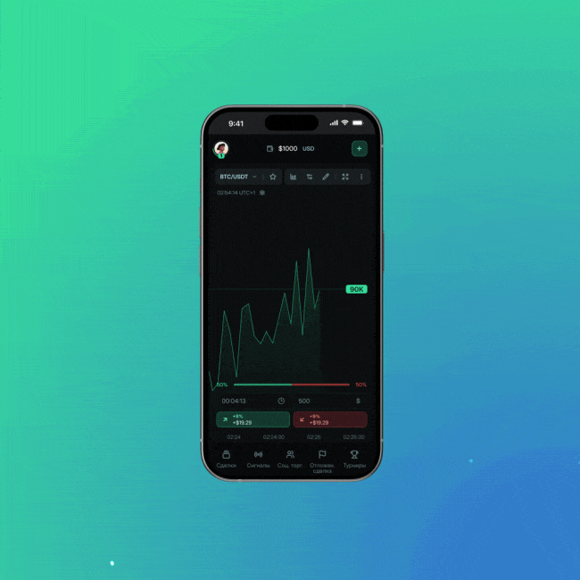
ProTrade
MultipageDashboard

The name "Serenus" comes from the word "Serenity", which means calm and tranquility. When developing a corporate identity, it will be important to convey a sense of elegance, calm and tranquility. A neat straight font will be used in combination with a handwritten style in the descriptor. Blue and beige colors should be the main ones for the brand, since they symbolize calm, comfort and harmony.


We'll fill out a brief and start cooperation
We'll tell you about terms, deadlines and cost
We'll choose the optimal option for you
We'll answer all questions about website development
ProTrade

Studeks
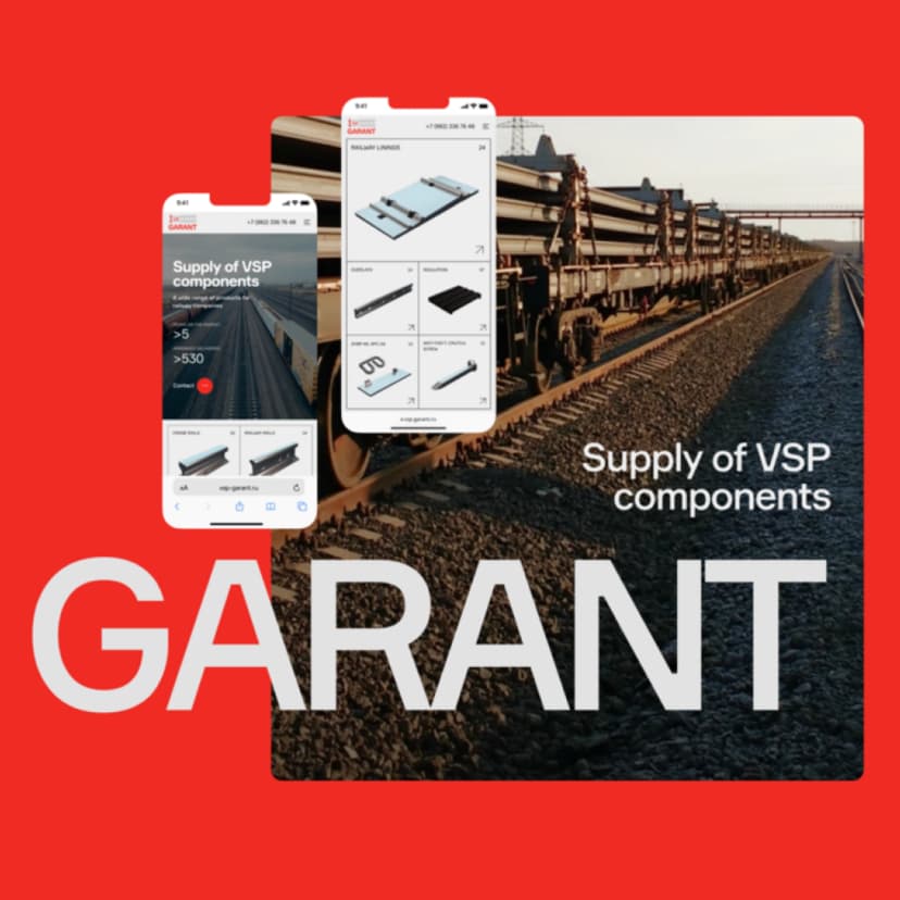
VSP-Garant

Second hands
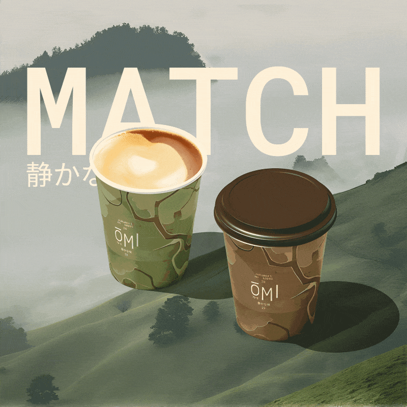
Omi

MURU